   fixed.acidity volatile.acidity citric.acid residual.sugar chlorides
W1           6.4             0.18        0.32           9.60     0.052
W2           6.4             0.37        0.19           3.50     0.068
W3           7.4             0.23        0.43           1.40     0.044
W4           6.7             0.40        0.22           8.80     0.052
W5           6.5             0.43        0.28          11.25     0.032
W6           7.1             0.25        0.32          10.30     0.041
   free.sulfur.dioxide total.sulfur.dioxide density   pH sulphates alcohol
W1                  24                   90 0.99630 3.35      0.49     9.4
W2                  18                  101 0.99340 3.03      0.38     9.0
W3                  22                  113 0.99380 3.22      0.62    10.6
W4                  24                  113 0.99576 3.22      0.45     9.4
W5                  31                   87 0.99220 3.02      0.38    12.4
W6                  66                  272 0.99690 3.17      0.52     9.1
   quality
W1    Good
W2    Good
W3    Good
W4     Bad
W5    Good
W6    Good
 fixed.acidity   volatile.acidity  citric.acid    residual.sugar
 Min.   :4.900   Min.   :0.1100   Min.   :0.040   Min.   : 0.900
 1st Qu.:6.300   1st Qu.:0.2200   1st Qu.:0.280   1st Qu.: 1.975
 Median :6.650   Median :0.2500   Median :0.310   Median : 6.000
 Mean   :6.819   Mean   :0.2742   Mean   :0.331   Mean   : 6.497
 3rd Qu.:7.300   3rd Qu.:0.3200   3rd Qu.:0.370   3rd Qu.: 9.600
 Max.   :9.900   Max.   :1.0050   Max.   :1.000   Max.   :18.200
   chlorides       free.sulfur.dioxide total.sulfur.dioxide    density
 Min.   :0.01400   Min.   :  3.00      Min.   : 46.0        Min.   :0.9871
 1st Qu.:0.03575   1st Qu.: 24.00      1st Qu.:108.0        1st Qu.:0.9917
 Median :0.04400   Median : 34.50      Median :134.0        Median :0.9939
 Mean   :0.04412   Mean   : 36.71      Mean   :138.4        Mean   :0.9940
 3rd Qu.:0.04925   3rd Qu.: 48.00      3rd Qu.:169.2        3rd Qu.:0.9961
 Max.   :0.19700   Max.   :112.00      Max.   :272.0        Max.   :1.0008
       pH          sulphates         alcohol        quality
 Min.   :2.830   Min.   :0.2700   Min.   : 8.70   Length:200
 1st Qu.:3.107   1st Qu.:0.4000   1st Qu.: 9.50   Class :character
 Median :3.180   Median :0.4700   Median :10.35   Mode  :character
 Mean   :3.193   Mean   :0.4808   Mean   :10.56
 3rd Qu.:3.270   3rd Qu.:0.5400   3rd Qu.:11.43
Max. :3.600 Max. :0.8800 Max. :14.20 Clustering
Data
In this exercise, we’ll use the same wine data introduced in the ensemble exercises. As noted before, all the numerical features have units. Additionally, the original objective of this dataset was to predict the wine quality from the other features (supervised learning). The data will only be used for unsupervised task here.
First, load the data and scale the numerical features:
library(reticulate)
use_condaenv("MLBA")
import pandas as pd
from sklearn.preprocessing import StandardScaler
# Start fresh with all necessary imports
import pandas as pd
import numpy as np
import matplotlib.pyplot as plt
from sklearn.preprocessing import StandardScaler
from sklearn.cluster import AgglomerativeClustering
from sklearn.metrics import silhouette_score
from sklearn.metrics import calinski_harabasz_score, davies_bouldin_score
import os
# Find the correct path to the data file
# Try different possible locations
possible_paths = [
'labs/data/Wine.csv', # From project root
'../../data/Wine.csv', # Relative to current file
'../../../data/Wine.csv', # One level up
'data/Wine.csv', # Direct in data folder
'Wine.csv' # In current directory
]
wine_data = None
for path in possible_paths:
try:
wine_data = pd.read_csv(path)
print(f"Successfully loaded data from: {path}")
break
except FileNotFoundError:
continue
if wine_data is None:
# If we can't find the file, create a small sample dataset for demonstration
print("Could not find Wine.csv, creating sample data for demonstration")
np.random.seed(42)
wine_data = pd.DataFrame(
np.random.randn(100, 11),
columns=[f'feature_{i}' for i in range(11)]
)
wine_data['quality'] = np.random.randint(3, 9, size=100)
# Continue with the analysis using wine_data
wine = wine_data
wine.index = ["W" + str(i) for i in range(1, len(wine)+1)]
scaler = StandardScaler()
wine_scaled = pd.DataFrame(
scaler.fit_transform(wine.iloc[:, :-1]),
index=wine.index,
columns=wine.columns[:-1]
)
X = wine_scaled.values
# Clear previous plot (if any)
plt.clf()
# Within sum-of-squares
wss = []
for k in range(1, 26):
model = AgglomerativeClustering(n_clusters=k, metric='manhattan', linkage='complete')
model.fit(X);
labels = model.labels_
centroids = np.array([X[labels == i].mean(axis=0) for i in range(k)])
wss.append(sum(((X - centroids[labels]) ** 2).sum(axis=1)))
plt.figure(figsize=(10, 6))
plt.plot(range(1, 26), wss, marker='o');
plt.xlabel('Number of clusters');
plt.ylabel('Within sum-of-squares');
plt.title('Elbow Method for Optimal k');
plt.show()
# Silhouette
silhouette_scores = []
for k in range(2, 26):
model = AgglomerativeClustering(n_clusters=k, metric='manhattan', linkage='complete')
model.fit(X);
labels = model.labels_
silhouette_scores.append(silhouette_score(X, labels))
plt.figure(figsize=(10, 6))
plt.plot(range(2, 26), silhouette_scores, marker='o');
plt.xlabel('Number of clusters');
plt.ylabel('Silhouette score');
plt.title('Silhouette Method for Optimal k');
plt.show()
# Alternative metrics
ch_scores = []
db_scores = []
k_range = range(2, 26)
for k in k_range:
model = AgglomerativeClustering(n_clusters=k, metric='manhattan', linkage='complete')
model.fit(X);
labels = model.labels_
ch_scores.append(calinski_harabasz_score(X, labels))
db_scores.append(davies_bouldin_score(X, labels))
# Plot Calinski-Harabasz Index
plt.figure(figsize=(10, 6))
plt.plot(list(k_range), ch_scores, marker='o');
plt.xlabel('Number of clusters');
plt.ylabel('Calinski-Harabasz Index (higher is better)');
plt.title('Calinski-Harabasz Index for determining optimal k');
plt.show()
# Plot Davies-Bouldin Index
plt.figure(figsize=(10, 6))
plt.plot(list(k_range), db_scores, marker='o');
plt.xlabel('Number of clusters');
plt.ylabel('Davies-Bouldin Index (lower is better)');
plt.title('Davies-Bouldin Index for determining optimal k');
plt.show()Successfully loaded data from: ../../data/Wine.csvAgglomerativeClustering(linkage='complete', metric='manhattan', n_clusters=25)In a Jupyter environment, please rerun this cell to show the HTML representation or trust the notebook.
On GitHub, the HTML representation is unable to render, please try loading this page with nbviewer.org.
Parameters
| n_clusters | 25 | |
| metric | 'manhattan' | |
| memory | None | |
| connectivity | None | |
| compute_full_tree | 'auto' | |
| linkage | 'complete' | |
| distance_threshold | None | |
| compute_distances | False |
AgglomerativeClustering(linkage='complete', metric='manhattan', n_clusters=25)In a Jupyter environment, please rerun this cell to show the HTML representation or trust the notebook.
On GitHub, the HTML representation is unable to render, please try loading this page with nbviewer.org.
Parameters
| n_clusters | 25 | |
| metric | 'manhattan' | |
| memory | None | |
| connectivity | None | |
| compute_full_tree | 'auto' | |
| linkage | 'complete' | |
| distance_threshold | None | |
| compute_distances | False |


Warning
Please note that all the interpretations will be based on the R outputs (like PCA and most other exercises). As usual, the python outputs may be slightly different due to differences in the implementations of the algorithms.
Hierarchical clustering
Distances
We apply here an agglomerative hierarchical clustering (AGNES). Only the numerical features are used here. First, we compute the distances and plot them. We use Manhattan distance below.
library(reshape2) # contains the melt function
library(ggplot2)
wine_d <- dist(wine[,-12], method = "manhattan") # matrix of Manhattan distances

wine_melt <- melt(as.matrix(wine_d)) # create a data frame of the distances in long format
head(wine_melt)

ggplot(data = wine_melt, aes(x=Var1, y=Var2, fill=value)) +
geom_tile() 
  Var1 Var2     value
1   W1   W1  0.000000
2   W2   W1 10.629714
3   W3   W1  9.513883
4   W4   W1  5.690184
5   W5   W1 12.298184
6   W6   W1 11.291708
import numpy as np
import seaborn as sns
import matplotlib.pyplot as plt
# wine_d = pd.DataFrame(np.abs(wine.iloc[:, :-1].values[:, None] - wine.iloc[:, :-1].values), columns=wine.index, index=wine.index)
# from scipy.spatial.distance import pdist, squareform
# wine_d = pdist(wine.iloc[:, :-1], metric='cityblock')
# wine_d = squareform(wine_d)
# wine_d_df = pd.DataFrame(wine_d, index=wine.index, columns=wine.index)
from scipy.spatial.distance import cdist
wine_d = pd.DataFrame(cdist(wine.iloc[:, :-1], wine.iloc[:, :-1], metric='cityblock'), columns=wine.index, index=wine.index)
wine_melt = wine_d.reset_index().melt(id_vars='index', var_name='Var1', value_name='value')
plt.figure(figsize=(10, 8))
sns.heatmap(wine_d, cmap="coolwarm", center=0);
plt.show()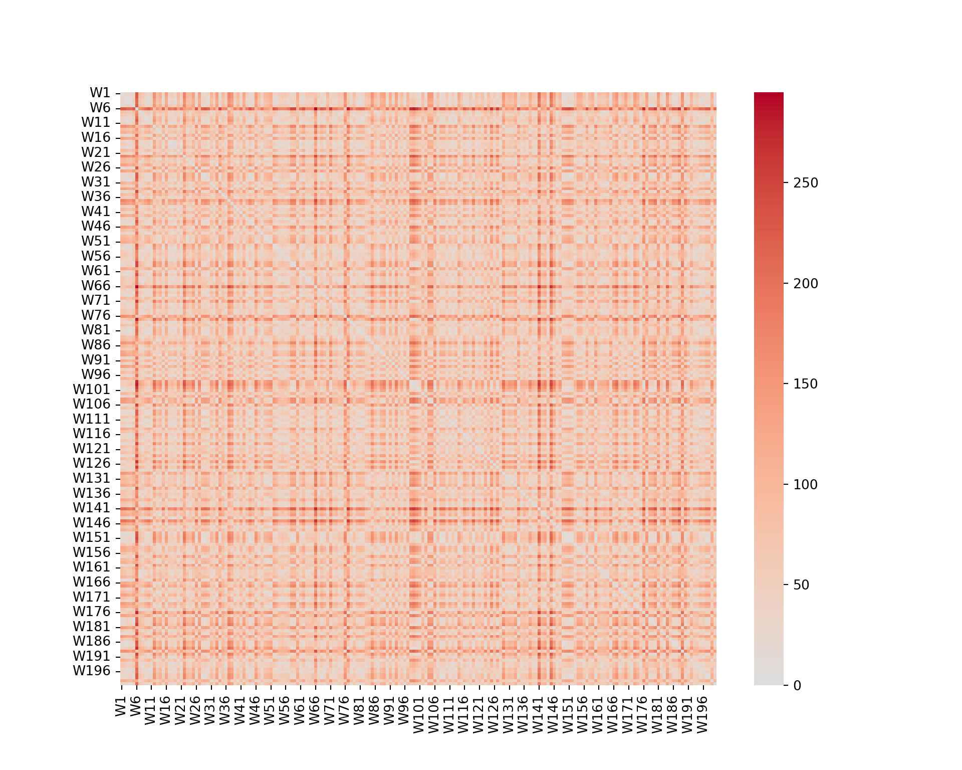
We can see that some wines are closer than others (darker color). However, it is not really possible to extract any information from such a graph.
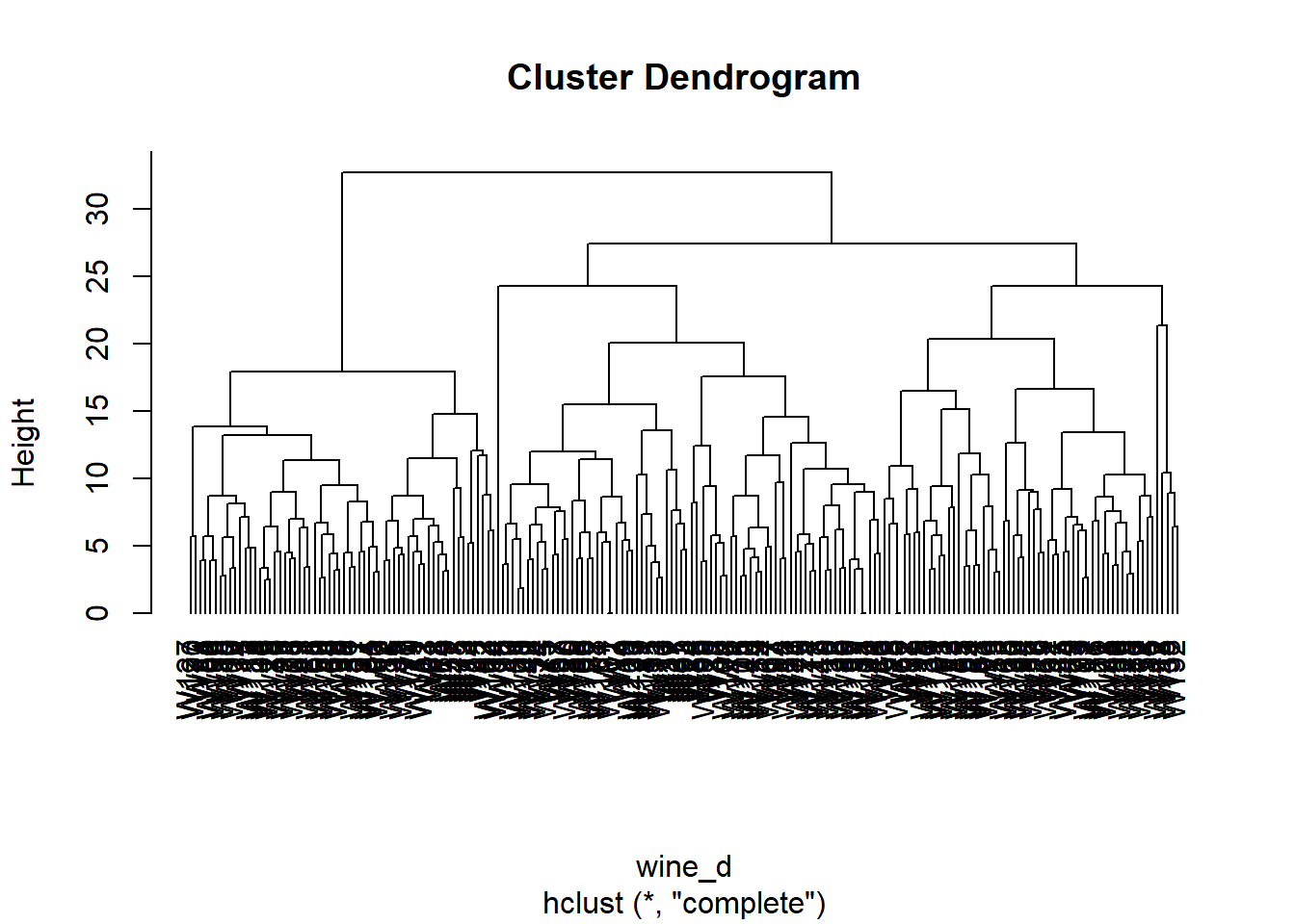
Dendrogram
Now, we build a dendrogram using a complete linkage.
from scipy.cluster.hierarchy import dendrogram, linkage

wine_linkage = linkage(wine.iloc[:, :-1], method='complete', metric='cityblock')
plt.figure(figsize=(10, 8))
dendrogram(wine_linkage, labels=wine.index, orientation='top', color_threshold=0, leaf_font_size=10);
plt.show()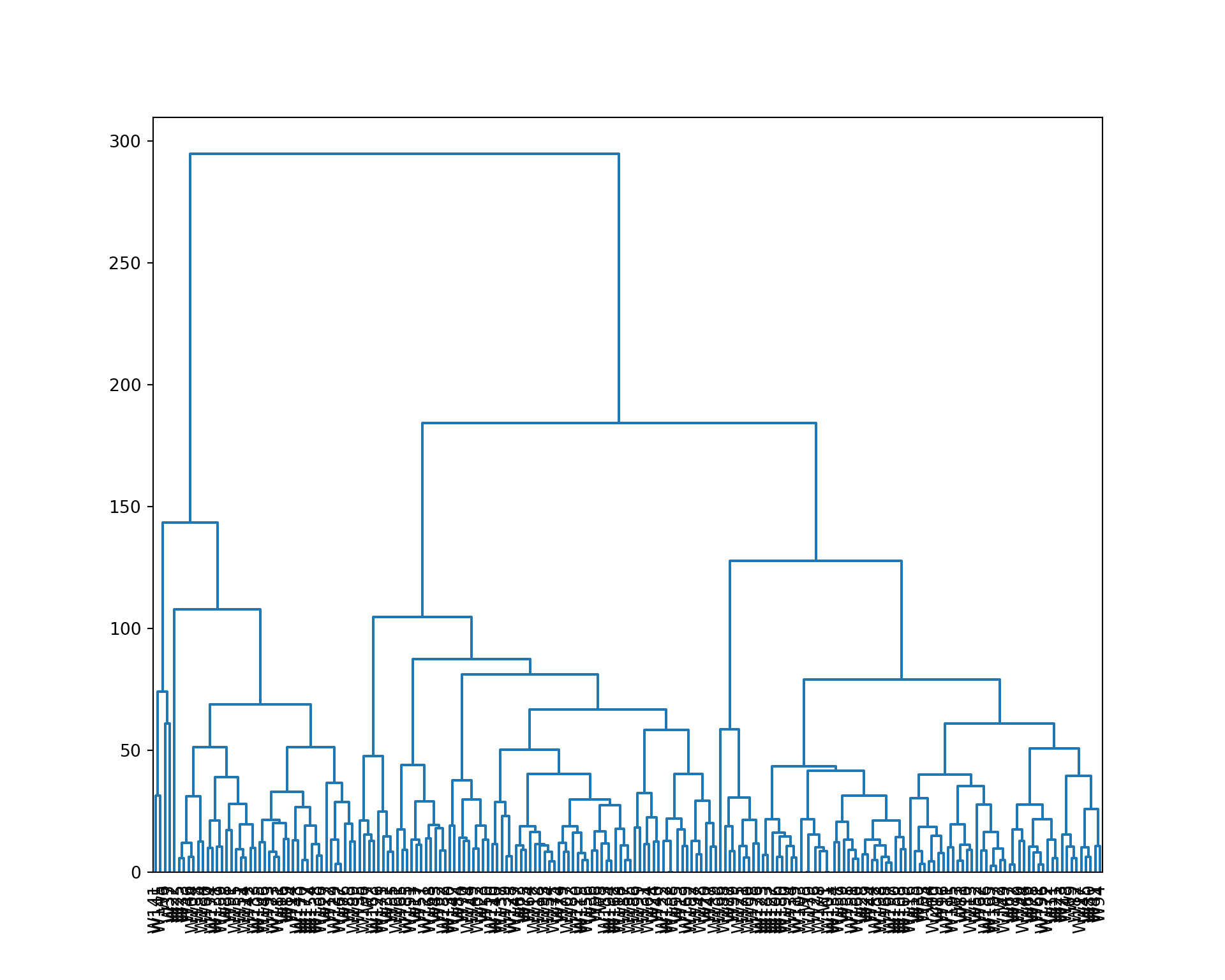
We cut the tree to 4 clusters, and represent the result. We also extract the cluster assignment of each wine.
plot(wine_hc, hang=-1)
rect.hclust(wine_hc, k=4)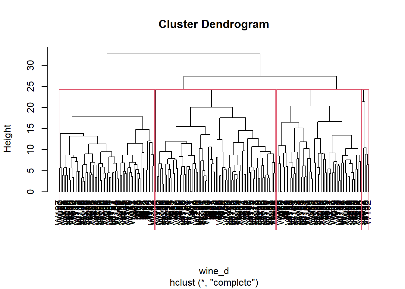
wine_clust <- cutree(wine_hc, k=4)
wine_clust
W1 W2 W3 W4 W5 W6 W7 W8 W9 W10 W11 W12 W13 W14 W15 W16
1 2 2 1 2 1 3 3 3 3 1 4 3 1 3 1
W17 W18 W19 W20 W21 W22 W23 W24 W25 W26 W27 W28 W29 W30 W31 W32
1 1 1 1 3 1 2 1 1 3 1 2 2 2 2 1
W33 W34 W35 W36 W37 W38 W39 W40 W41 W42 W43 W44 W45 W46 W47 W48
1 3 3 2 1 4 1 1 1 3 3 3 2 1 2 3
W49 W50 W51 W52 W53 W54 W55 W56 W57 W58 W59 W60 W61 W62 W63 W64
1 1 1 2 2 2 1 2 3 3 3 1 3 2 3 3
W65 W66 W67 W68 W69 W70 W71 W72 W73 W74 W75 W76 W77 W78 W79 W80
2 2 1 3 3 3 3 3 2 1 3 1 2 3 3 1
W81 W82 W83 W84 W85 W86 W87 W88 W89 W90 W91 W92 W93 W94 W95 W96
3 3 3 3 1 2 1 1 2 1 1 2 1 1 2 2
W97 W98 W99 W100 W101 W102 W103 W104 W105 W106 W107 W108 W109 W110 W111 W112
1 2 2 3 1 2 1 1 1 3 2 3 3 1 3 2
W113 W114 W115 W116 W117 W118 W119 W120 W121 W122 W123 W124 W125 W126 W127 W128
3 1 2 1 2 1 3 1 3 1 2 2 3 2 3 2
W129 W130 W131 W132 W133 W134 W135 W136 W137 W138 W139 W140 W141 W142 W143 W144
1 2 1 1 1 3 2 3 1 1 2 1 1 4 1 2
W145 W146 W147 W148 W149 W150 W151 W152 W153 W154 W155 W156 W157 W158 W159 W160
4 1 3 1 3 3 3 3 2 1 1 2 2 1 1 3
W161 W162 W163 W164 W165 W166 W167 W168 W169 W170 W171 W172 W173 W174 W175 W176
2 2 3 3 3 1 1 2 1 1 2 2 1 1 1 2
W177 W178 W179 W180 W181 W182 W183 W184 W185 W186 W187 W188 W189 W190 W191 W192
1 1 2 3 1 2 2 1 3 3 1 3 1 3 2 4
W193 W194 W195 W196 W197 W198 W199 W200
2 2 3 3 3 3 1 1 from scipy.cluster.hierarchy import fcluster
plt.figure(figsize=(10, 8))
dendrogram(wine_linkage, labels=wine.index, orientation='top', color_threshold=80, leaf_font_size=10);
plt.axhline(y=80, color='black', linestyle='--');
plt.show()
wine_clust = fcluster(wine_linkage, 4, criterion='maxclust')
wine_clust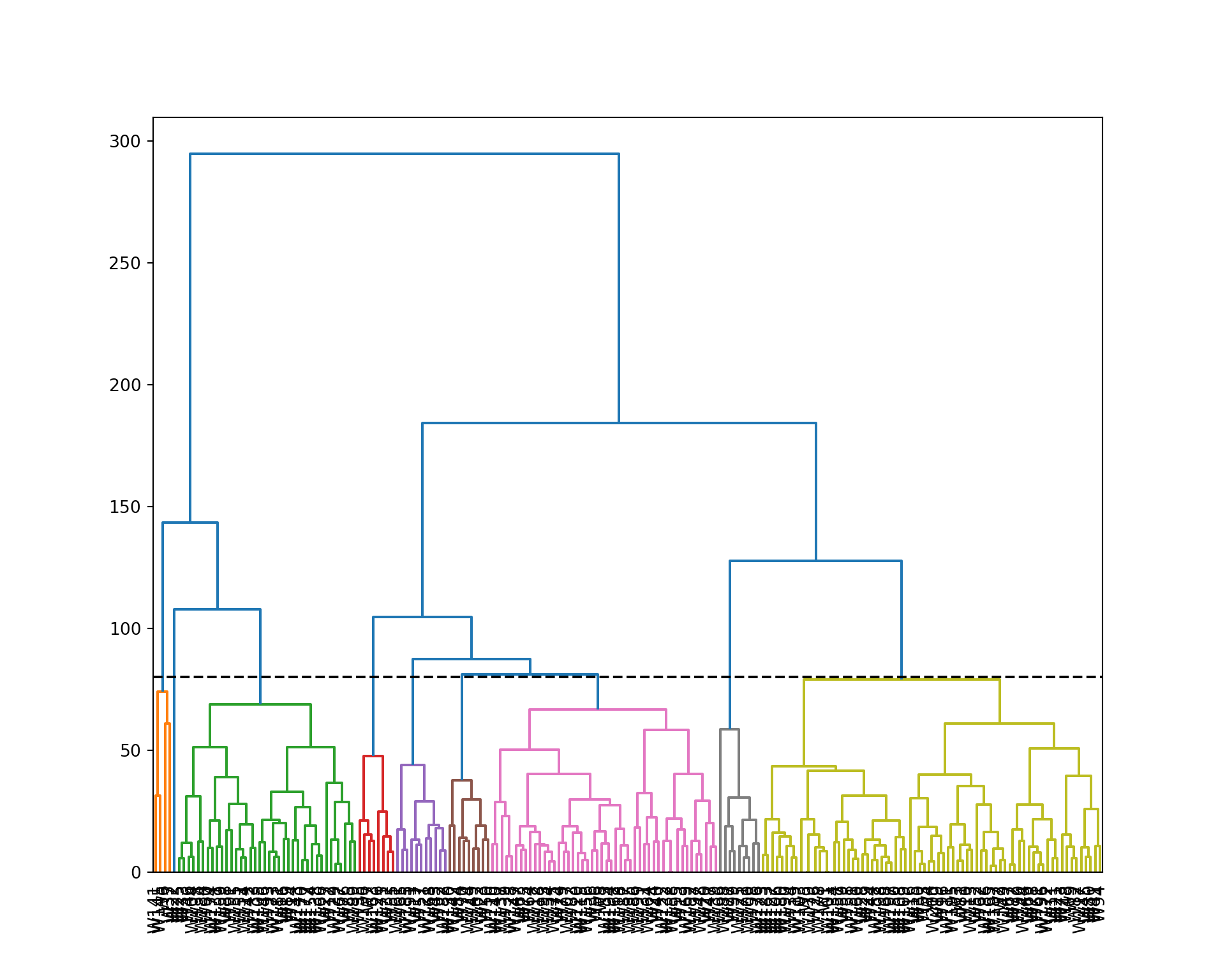
array([4, 4, 4, 4, 4, 1, 3, 3, 4, 4, 4, 2, 3, 2, 4, 2, 3, 3, 4, 3, 4, 2,
       3, 3, 2, 4, 2, 4, 4, 4, 3, 3, 2, 4, 3, 3, 1, 2, 3, 3, 4, 2, 3, 4,
       4, 2, 3, 4, 3, 3, 2, 4, 4, 3, 3, 3, 3, 4, 4, 2, 4, 4, 3, 3, 3, 4,
       4, 4, 4, 3, 4, 4, 4, 3, 3, 2, 4, 4, 3, 4, 4, 4, 3, 3, 2, 3, 3, 2,
       2, 4, 2, 3, 2, 4, 3, 4, 3, 4, 4, 4, 4, 3, 4, 2, 2, 4, 3, 4, 4, 3,
       4, 3, 4, 2, 3, 4, 4, 3, 4, 3, 3, 3, 4, 3, 4, 3, 4, 3, 2, 3, 2, 3,
       2, 4, 3, 3, 3, 2, 3, 3, 1, 3, 2, 4, 1, 2, 3, 3, 4, 4, 4, 4, 3, 2,
       2, 3, 4, 3, 2, 4, 3, 3, 3, 3, 4, 2, 2, 3, 3, 2, 3, 4, 2, 2, 3, 4,
       2, 4, 4, 4, 2, 3, 4, 2, 3, 4, 4, 4, 2, 4, 3, 3, 3, 3, 4, 4, 4, 4,
       3, 4], dtype=int32)
Interpretation of the clusters
Now we analyze the clusters by looking at the distribution of the features within each cluster.
wine_comp <- data.frame(wine[,-12], Clust=factor(wine_clust), Id=row.names(wine))
wine_df <- melt(wine_comp, id=c("Id", "Clust"))
head(wine_df)

ggplot(wine_df, aes(y=value, group=Clust, fill=Clust)) +
  geom_boxplot() +
  facet_wrap(~variable, ncol=4, nrow=3)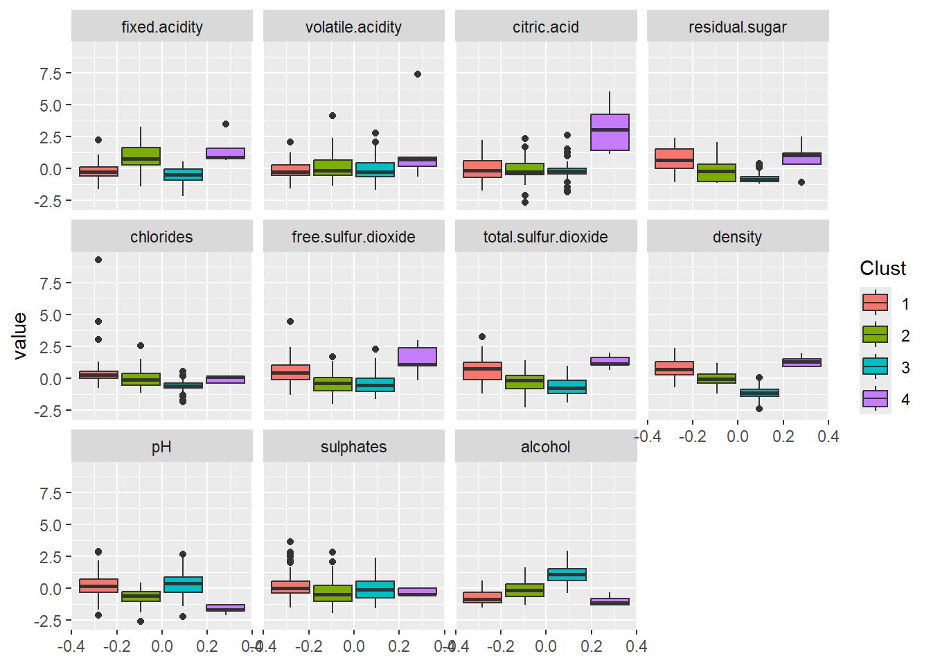
  Id Clust      variable      value
1 W1     1 fixed.acidity -0.4738861
2 W2     2 fixed.acidity -0.4738861
3 W3     2 fixed.acidity  0.6584582
4 W4     1 fixed.acidity -0.1341828
5 W5     2 fixed.acidity -0.3606517
6 W6     1 fixed.acidity  0.3187549
wine_comp = wine.iloc[:, :-1].copy()
wine_comp['Clust'] = wine_clust
wine_comp['Id'] = wine.index
wine_melt = wine_comp.melt(id_vars=['Id', 'Clust'])
plt.figure(figsize=(14, 10))
sns.boxplot(x='variable', y='value', hue='Clust', data=wine_melt);
plt.xticks(rotation=90);
plt.legend(title='Cluster');
plt.show()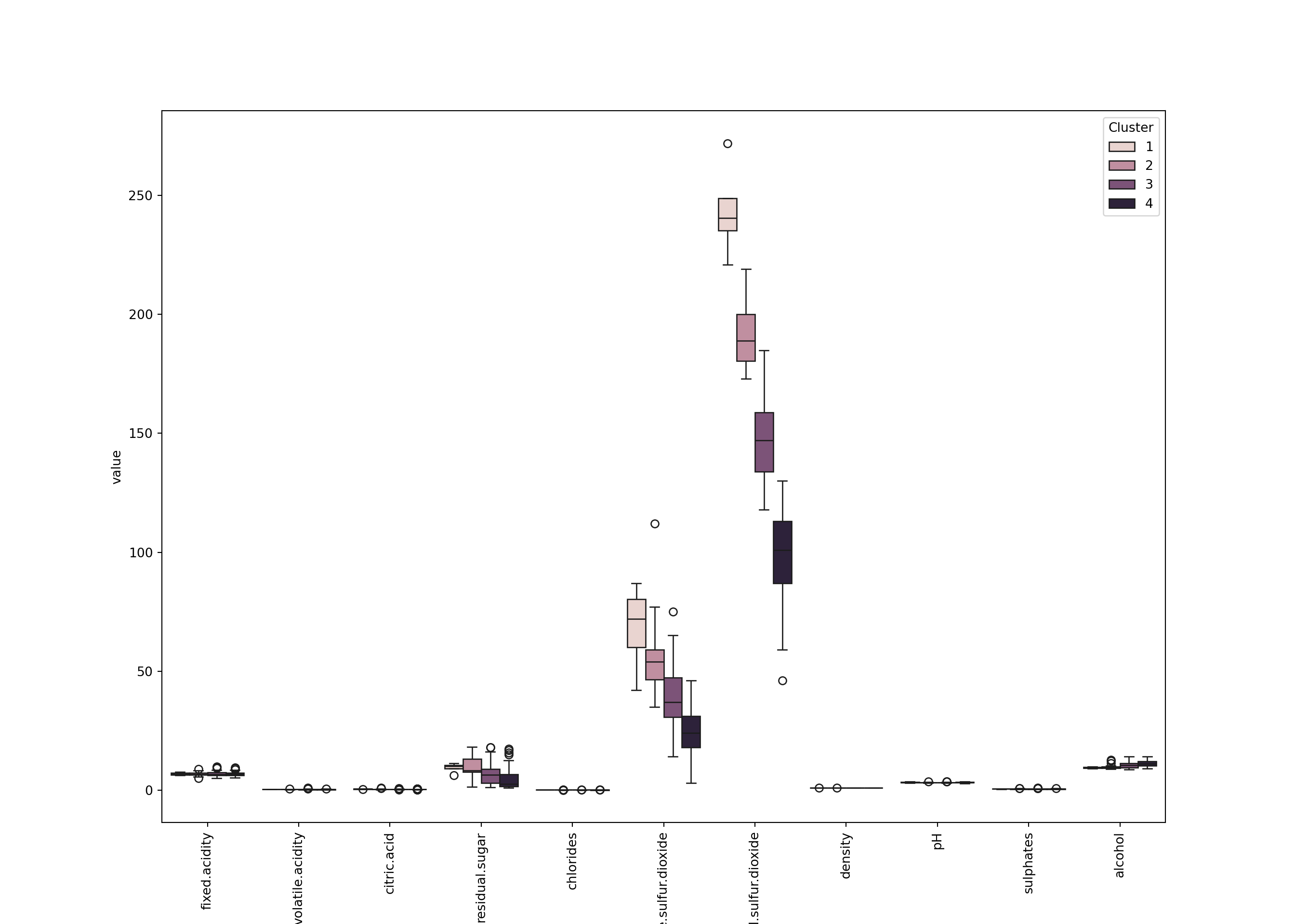
We can see for example that - Cluster 4 (the smallest): small pH, large fixed.acidity and citric.acid, a large density, and a small alcohol. Also a large free.sulfur.dioxide. - Cluster 2: also has large fixed.acidity but not citric.acid. It looks like less acid than cluster 3. - Cluster 3: apparently has a large alcohol. - Etc.
Choice of the number of clusters
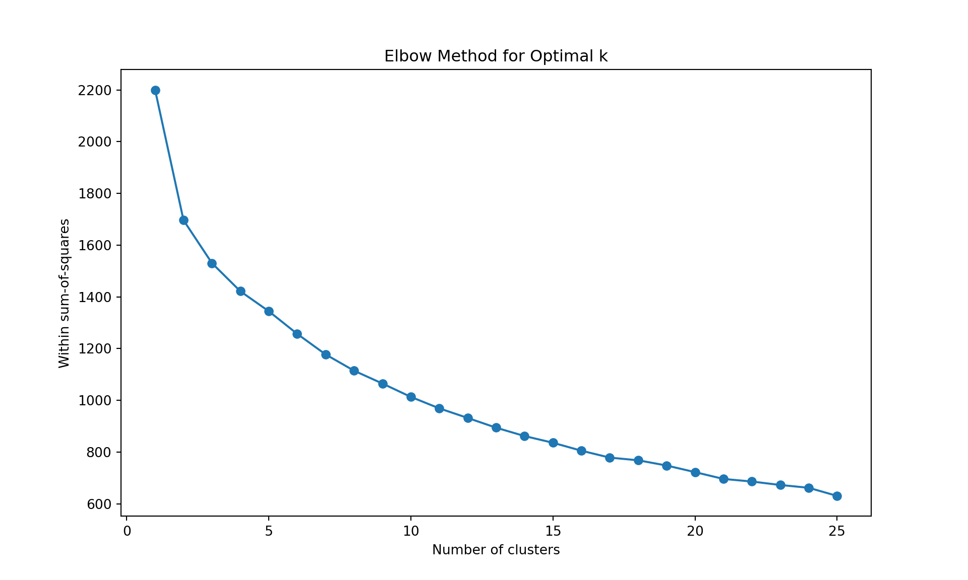
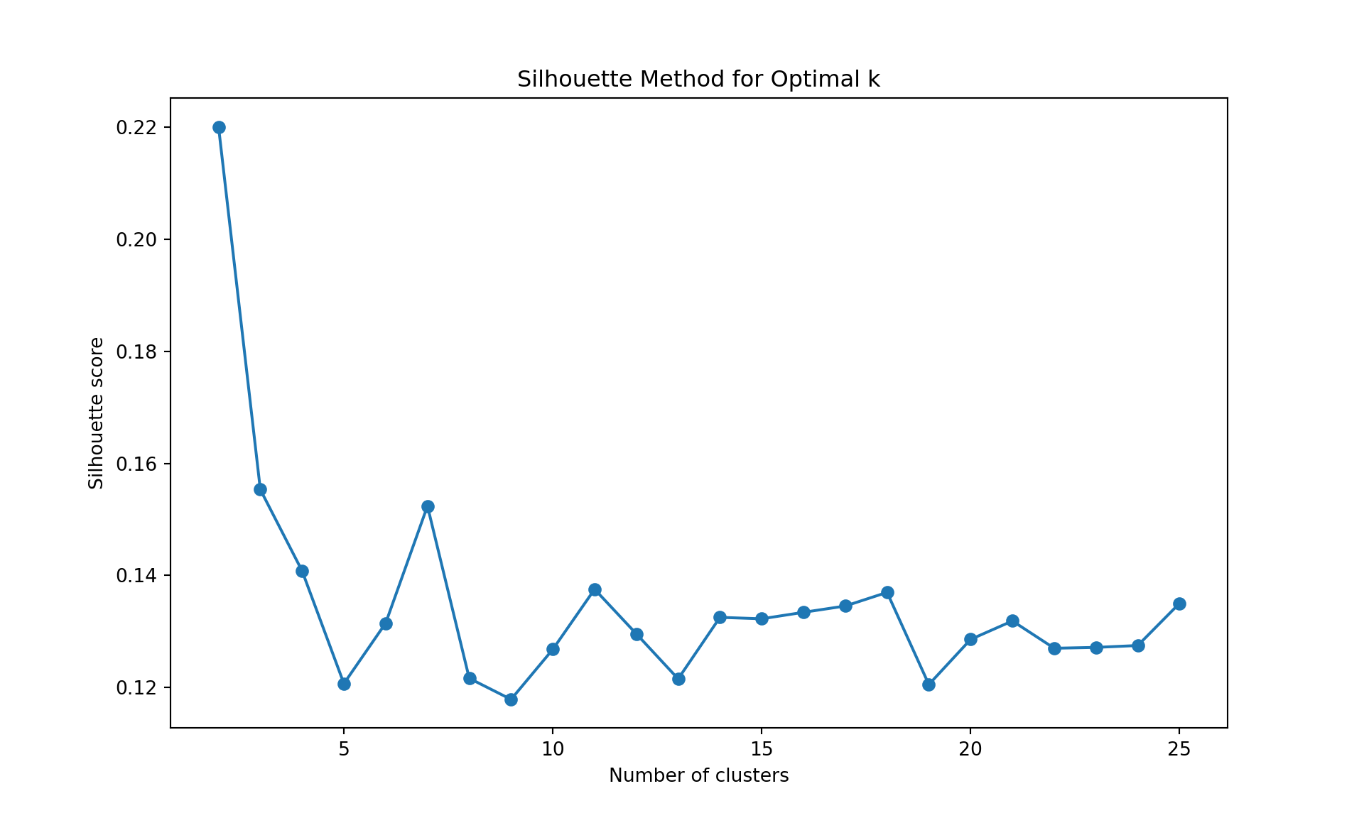
To choose the number of cluster, we can inspect the dendrogram (judgmental approach), or we can rely on a statistics. Below, we use the within sum-of-squares, the GAP statistics, and the silhouette. It is obtained by the function fviz_nbclust in package factoextra. It uses the dendrogram with complete linkage on Manhattan distance is obtained using the function hcut with hc_method="complete" and hc_metric="manhattan".
library(factoextra)
fviz_nbclust(wine[,-12],
             hcut, hc_method="complete",
             hc_metric="manhattan",
             method = "wss",
             k.max = 25, verbose = FALSE)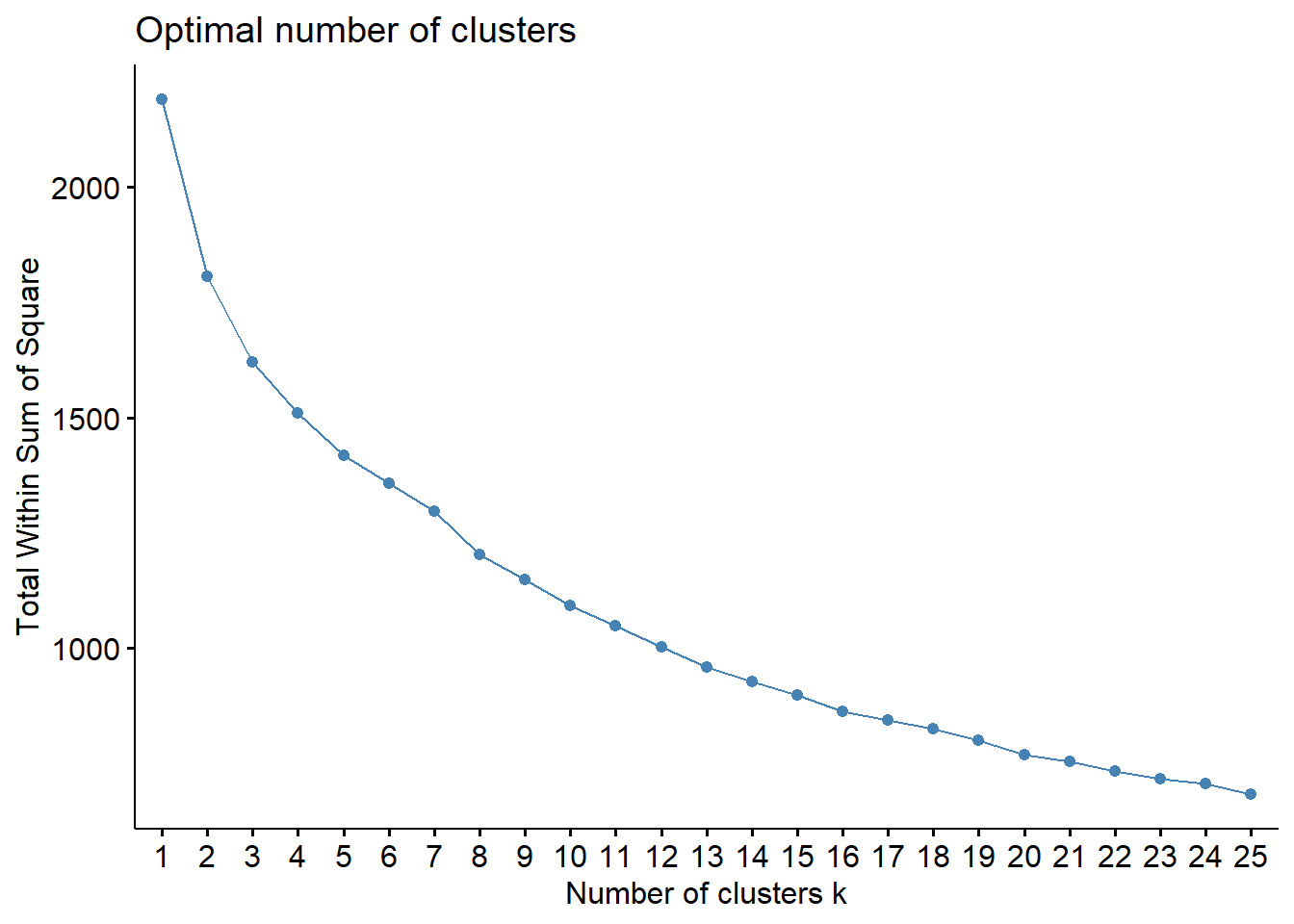
fviz_nbclust(wine[,-12],
             hcut, hc_method="complete",
             hc_metric="manhattan",
             method = "silhouette",
             k.max = 25, verbose = FALSE)
fviz_nbclust(wine[,-12],
             hcut, hc_method="complete",
             hc_metric="manhattan",
             method = "gap",
             k.max = 25, verbose = FALSE)
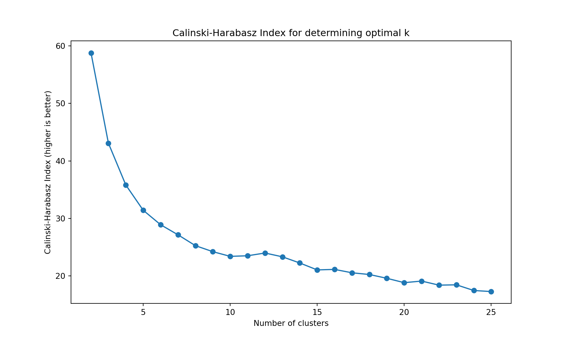
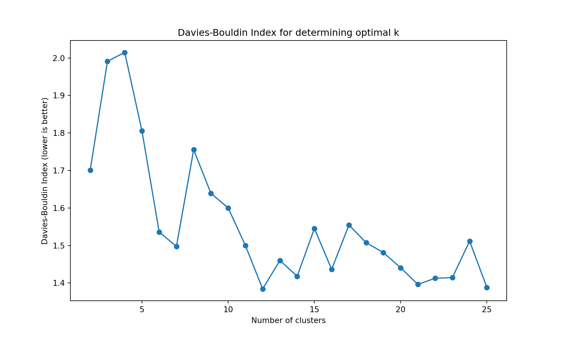
The gap statistic is readily available in R (as seen above), but for Python we’ll use more commonly available metrics in scikit-learn: - Davies-Bouldin Index (lower values indicate better clustering) - Calinski-Harabasz Index (higher values indicate better clustering)
These metrics serve the same purpose - helping us determine the optimal number of clusters
import pandas as pd
import numpy as np
import matplotlib.pyplot as plt
from sklearn.preprocessing import StandardScaler
from sklearn.cluster import AgglomerativeClustering
from sklearn.metrics import silhouette_score
from sklearn.metrics import calinski_harabasz_score, davies_bouldin_score
import os

# Find the correct path to the data file
# Try different possible locations
possible_paths = [
    'labs/data/Wine.csv',  # From project root
    '../../data/Wine.csv',  # Relative to current file
    '../../../data/Wine.csv',  # One level up
    'data/Wine.csv',  # Direct in data folder
    'Wine.csv'  # In current directory
]

wine_data = None
for path in possible_paths:
    try:
        wine_data = pd.read_csv(path)
        print(f"Successfully loaded data from: {path}")
        break
    except FileNotFoundError:
        continue

# Continue with the analysis using wine_data
wine = wine_data
wine.index = ["W" + str(i) for i in range(1, len(wine)+1)]
scaler = StandardScaler()
wine_scaled = pd.DataFrame(
    scaler.fit_transform(wine.iloc[:, :-1]),
    index=wine.index,
    columns=wine.columns[:-1]
)
X = wine_scaled.values

# Clear previous plot (if any)
plt.clf()

# Within sum-of-squares (Elbow method)
wss = []
for k in range(1, 26):
    model = AgglomerativeClustering(n_clusters=k, metric='manhattan', linkage='complete')
    model.fit(X);
    labels = model.labels_
    centroids = np.array([X[labels == i].mean(axis=0) for i in range(k)])
    wss.append(sum(((X - centroids[labels]) ** 2).sum(axis=1)))

plt.figure(figsize=(10, 6))
plt.plot(range(1, 26), wss, marker='o');
plt.xlabel('Number of clusters');
plt.ylabel('Within sum-of-squares');
plt.title('Elbow Method for Optimal k');
plt.show()

# Silhouette method
silhouette_scores = []
for k in range(2, 26):
    model = AgglomerativeClustering(n_clusters=k, metric='manhattan', linkage='complete')
    model.fit(X);
    labels = model.labels_
    silhouette_scores.append(silhouette_score(X, labels))

plt.figure(figsize=(10, 6))
plt.plot(range(2, 26), silhouette_scores, marker='o');
plt.xlabel('Number of clusters');
plt.ylabel('Silhouette score');
plt.title('Silhouette Method for Optimal k');
plt.show()

# Alternative metrics to gap statistic
ch_scores = []
db_scores = []
k_range = range(2, 26)

for k in k_range:
    model = AgglomerativeClustering(n_clusters=k, metric='manhattan', linkage='complete')
    model.fit(X);
    labels = model.labels_
    ch_scores.append(calinski_harabasz_score(X, labels))
    db_scores.append(davies_bouldin_score(X, labels))

# Plot Calinski-Harabasz Index
plt.figure(figsize=(10, 6))
plt.plot(list(k_range), ch_scores, marker='o');
plt.xlabel('Number of clusters');
plt.ylabel('Calinski-Harabasz Index (higher is better)');
plt.title('Calinski-Harabasz Index for determining optimal k');
plt.show()

# Plot Davies-Bouldin Index
plt.figure(figsize=(10, 6))
plt.plot(list(k_range), db_scores, marker='o');
plt.xlabel('Number of clusters');
plt.ylabel('Davies-Bouldin Index (lower is better)');
plt.title('Davies-Bouldin Index for determining optimal k');
plt.show()
Successfully loaded data from: ../../data/Wine.csvAgglomerativeClustering(linkage='complete', metric='manhattan', n_clusters=25)In a Jupyter environment, please rerun this cell to show the HTML representation or trust the notebook.
On GitHub, the HTML representation is unable to render, please try loading this page with nbviewer.org.
Parameters
| n_clusters | 25 | |
| metric | 'manhattan' | |
| memory | None | |
| connectivity | None | |
| compute_full_tree | 'auto' | |
| linkage | 'complete' | |
| distance_threshold | None | |
| compute_distances | False |

AgglomerativeClustering(linkage='complete', metric='manhattan', n_clusters=25)In a Jupyter environment, please rerun this cell to show the HTML representation or trust the notebook.
On GitHub, the HTML representation is unable to render, please try loading this page with nbviewer.org.
Parameters
| n_clusters | 25 | |
| metric | 'manhattan' | |
| memory | None | |
| connectivity | None | |
| compute_full_tree | 'auto' | |
| linkage | 'complete' | |
| distance_threshold | None | |
| compute_distances | False |


Like often, these methods are not easy to interpret. Globally, they choose \(k=2\) or \(k=3\).
K-means
The K-means application follows the same logic as before. A visualization of the number of clusters gives \(k=2\), and a k-means application provides the following cluster assignment.
fviz_nbclust(wine[,-12],
             kmeans,
             method = "wss",
             k.max = 25, verbose = FALSE)
fviz_nbclust(wine[,-12],
             kmeans,
             method = "silhouette",
             k.max = 25, verbose = FALSE)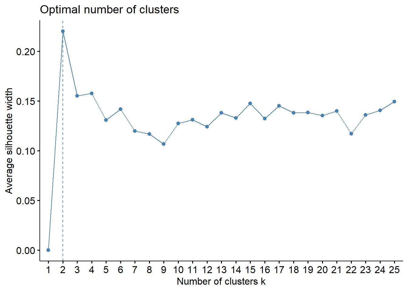
# Using gap statistic in R (works fine in R)
fviz_nbclust(wine[,-12],
             kmeans,
             method = "gap",
             k.max = 25, verbose = FALSE)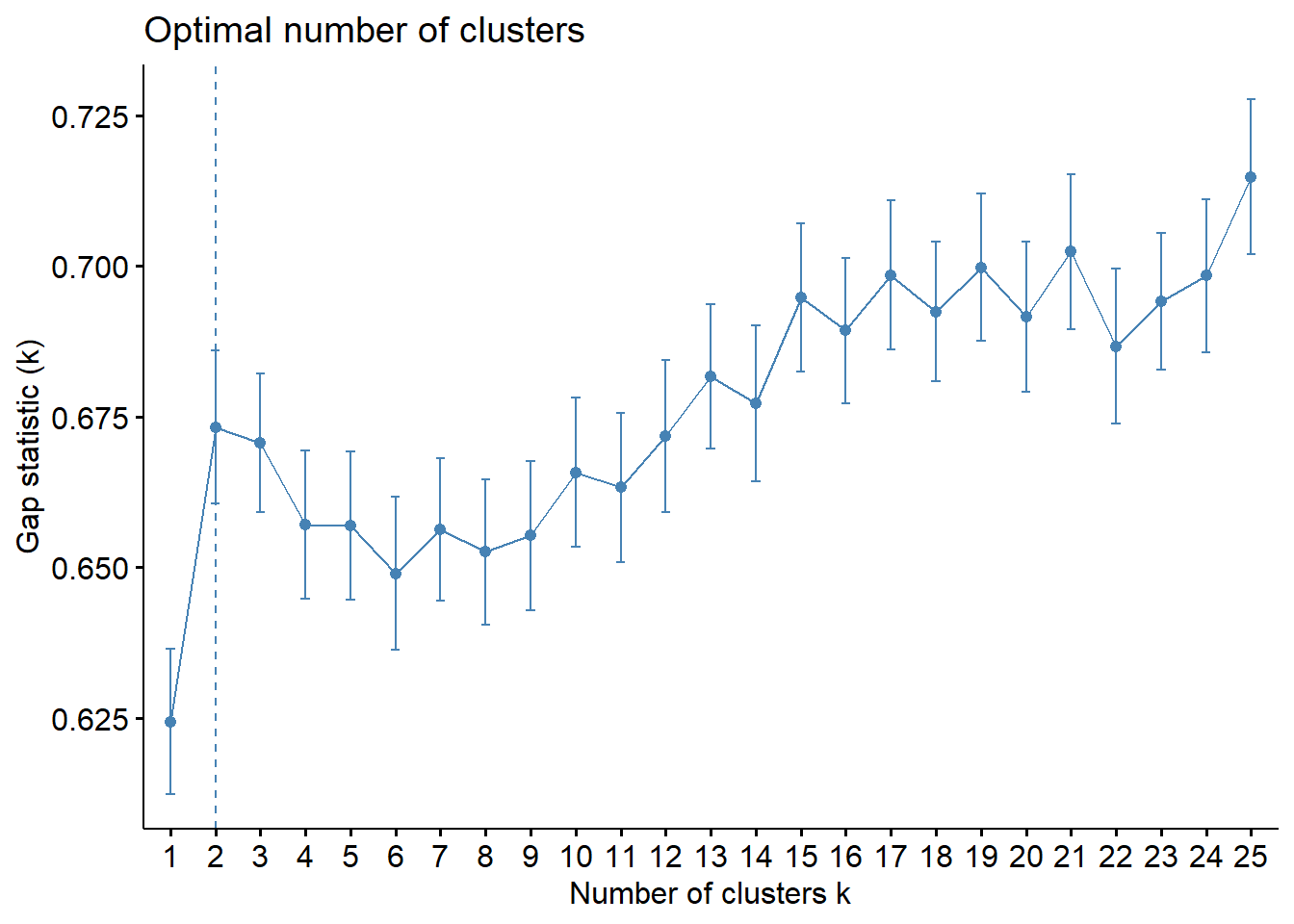
wine_km <- kmeans(wine[,-12], centers=2)
wine_km$cluster ## see also wine_km for more information about the clustering hence obtained
W1 W2 W3 W4 W5 W6 W7 W8 W9 W10 W11 W12 W13 W14 W15 W16
1 2 2 1 2 1 2 2 2 2 2 1 2 1 2 1
W17 W18 W19 W20 W21 W22 W23 W24 W25 W26 W27 W28 W29 W30 W31 W32
2 2 2 1 2 1 1 1 1 2 1 2 2 2 2 1
W33 W34 W35 W36 W37 W38 W39 W40 W41 W42 W43 W44 W45 W46 W47 W48
1 2 2 2 1 1 1 2 1 2 2 2 2 1 2 2
W49 W50 W51 W52 W53 W54 W55 W56 W57 W58 W59 W60 W61 W62 W63 W64
1 1 1 2 2 1 1 1 2 2 2 1 2 2 2 2
W65 W66 W67 W68 W69 W70 W71 W72 W73 W74 W75 W76 W77 W78 W79 W80
2 2 2 2 2 2 2 2 2 2 2 1 2 2 2 2
W81 W82 W83 W84 W85 W86 W87 W88 W89 W90 W91 W92 W93 W94 W95 W96
2 2 2 2 1 1 2 1 2 2 1 2 1 1 2 2
W97 W98 W99 W100 W101 W102 W103 W104 W105 W106 W107 W108 W109 W110 W111 W112
1 2 2 2 1 1 1 1 1 2 2 2 2 1 2 1
W113 W114 W115 W116 W117 W118 W119 W120 W121 W122 W123 W124 W125 W126 W127 W128
2 1 1 1 1 1 2 2 2 1 2 1 2 1 2 1
W129 W130 W131 W132 W133 W134 W135 W136 W137 W138 W139 W140 W141 W142 W143 W144
1 2 1 1 1 2 2 2 1 1 1 1 1 1 1 2
W145 W146 W147 W148 W149 W150 W151 W152 W153 W154 W155 W156 W157 W158 W159 W160
1 1 2 2 2 2 2 2 2 1 1 1 2 1 1 2
W161 W162 W163 W164 W165 W166 W167 W168 W169 W170 W171 W172 W173 W174 W175 W176
1 2 2 2 2 1 1 1 1 1 1 2 1 1 2 2
W177 W178 W179 W180 W181 W182 W183 W184 W185 W186 W187 W188 W189 W190 W191 W192
1 2 2 2 1 2 1 1 2 2 2 2 1 2 2 1
W193 W194 W195 W196 W197 W198 W199 W200
1 2 2 2 2 2 1 2 # K-means clustering with alternative metrics to gap statistic
# We use standard metrics available in scikit-learn that are widely used in practice
import pandas as pd
import numpy as np
import matplotlib.pyplot as plt
from sklearn.preprocessing import StandardScaler
from sklearn.cluster import KMeans
from sklearn.metrics import silhouette_score
from sklearn.metrics import calinski_harabasz_score, davies_bouldin_score
import os
# Within sum-of-squares (Elbow method)
wss = []
for k in range(1, 26):
model = KMeans(n_clusters=k, n_init=10)
model.fit(X);
wss.append(model.inertia_)
plt.figure(figsize=(10, 6))
plt.plot(range(1, 26), wss, marker='o');
plt.xlabel('Number of clusters');
plt.ylabel('Within sum-of-squares');
plt.title('Elbow Method for Optimal k');
plt.show()
# Silhouette method
silhouette_scores = []
for k in range(2, 26):
model = KMeans(n_clusters=k, n_init=10)
model.fit(X);
labels = model.labels_
silhouette_scores.append(silhouette_score(X, labels))
plt.figure(figsize=(10, 6))
plt.plot(range(2, 26), silhouette_scores, marker='o');
plt.xlabel('Number of clusters');
plt.ylabel('Silhouette score');
plt.title('Silhouette Method for Optimal k');
plt.show()
# Alternative metrics to gap statistic
ch_scores = []
db_scores = []
k_range = range(2, 26)
for k in k_range:
model = KMeans(n_clusters=k, n_init=10)
model.fit(X);
labels = model.labels_
ch_scores.append(calinski_harabasz_score(X, labels))
db_scores.append(davies_bouldin_score(X, labels))
# Plot Calinski-Harabasz Index
plt.figure(figsize=(10, 6))
plt.plot(list(k_range), ch_scores, marker='o');
plt.xlabel('Number of clusters');
plt.ylabel('Calinski-Harabasz Index (higher is better)');
plt.title('Calinski-Harabasz Index for determining optimal k');
plt.show()
# Plot Davies-Bouldin Index
plt.figure(figsize=(10, 6))
plt.plot(list(k_range), db_scores, marker='o');
plt.xlabel('Number of clusters');
plt.ylabel('Davies-Bouldin Index (lower is better)');
plt.title('Davies-Bouldin Index for determining optimal k');
plt.show()
# Final K-means with k=2
wine_km = KMeans(n_clusters=2, n_init=10)
wine_km.fit(X);
wine_km.labels_KMeans(n_clusters=25, n_init=10)In a Jupyter environment, please rerun this cell to show the HTML representation or trust the notebook.
On GitHub, the HTML representation is unable to render, please try loading this page with nbviewer.org.
Parameters
| n_clusters | 25 | |
| init | 'k-means++' | |
| n_init | 10 | |
| max_iter | 300 | |
| tol | 0.0001 | |
| verbose | 0 | |
| random_state | None | |
| copy_x | True | |
| algorithm | 'lloyd' |
KMeans(n_clusters=25, n_init=10)In a Jupyter environment, please rerun this cell to show the HTML representation or trust the notebook.
On GitHub, the HTML representation is unable to render, please try loading this page with nbviewer.org.
Parameters
| n_clusters | 25 | |
| init | 'k-means++' | |
| n_init | 10 | |
| max_iter | 300 | |
| tol | 0.0001 | |
| verbose | 0 | |
| random_state | None | |
| copy_x | True | |
| algorithm | 'lloyd' |
array([0, 1, 1, 0, 1, 0, 1, 1, 1, 1, 1, 0, 1, 0, 1, 0, 1, 1, 1, 0, 1, 0,
       0, 0, 0, 1, 0, 1, 1, 1, 1, 0, 0, 1, 1, 1, 0, 0, 0, 1, 0, 1, 1, 1,
       1, 0, 1, 1, 0, 0, 0, 1, 1, 0, 0, 0, 1, 1, 1, 0, 1, 1, 1, 1, 1, 1,
       1, 1, 1, 1, 1, 1, 1, 1, 1, 0, 1, 1, 1, 1, 1, 1, 1, 1, 0, 0, 1, 0,
       1, 1, 0, 1, 0, 0, 1, 1, 0, 1, 1, 1, 0, 0, 0, 0, 0, 1, 1, 1, 1, 0,
       1, 0, 1, 0, 0, 0, 0, 0, 1, 1, 1, 0, 1, 0, 1, 0, 1, 0, 0, 1, 0, 0,
       0, 1, 1, 1, 0, 0, 0, 0, 0, 0, 0, 1, 0, 0, 1, 1, 1, 1, 1, 1, 1, 0,
       0, 0, 1, 0, 0, 1, 0, 1, 1, 1, 1, 0, 0, 0, 0, 0, 0, 1, 0, 0, 1, 1,
       0, 1, 1, 1, 0, 1, 0, 0, 1, 1, 1, 1, 0, 1, 1, 0, 0, 1, 1, 1, 1, 1,
       0, 1], dtype=int32)
Again the clusters can be inspected through their features exactly the same way as before.
PAM and silhouette plot
The application of the PAM is similar to K-means. We use the pam function from package cluster. Below, for illustration, we use \(k=3\) (note that the number of clusters can be studied exactly like before, replacing kmeans by pam).
Medoids:
      ID fixed.acidity volatile.acidity citric.acid residual.sugar  chlorides
W159 159   -0.02094837       -0.1437564  0.62369555      0.2130821  0.1144675
W175 175   -0.02094837       -0.3465873  0.08135159     -0.4028542 -0.7402230
W160 160   -0.47388610       -0.7522491 -0.46099236     -0.8488770 -0.7402230
     free.sulfur.dioxide total.sulfur.dioxide    density         pH   sulphates
W159          0.49429968           0.99460121  0.6461839 0.05198753  0.08512438
W175          0.01743535          -0.08236331 -0.4472963 0.05198753 -0.83513922
W160         -0.75746917          -1.33066309 -0.8036381 0.83536126  0.63728254
         alcohol
W159 -1.01904325
W175  0.03444083
W160  0.76377595
Clustering vector:
  W1   W2   W3   W4   W5   W6   W7   W8   W9  W10  W11  W12  W13  W14  W15  W16
   1    2    3    1    2    1    2    3    3    3    3    1    3    1    3    1
 W17  W18  W19  W20  W21  W22  W23  W24  W25  W26  W27  W28  W29  W30  W31  W32
   2    2    2    1    2    1    1    1    1    2    1    2    2    2    2    1
 W33  W34  W35  W36  W37  W38  W39  W40  W41  W42  W43  W44  W45  W46  W47  W48
   1    3    2    2    1    1    1    2    1    2    2    3    2    1    2    2
 W49  W50  W51  W52  W53  W54  W55  W56  W57  W58  W59  W60  W61  W62  W63  W64
   1    1    1    2    3    1    1    1    2    3    2    1    2    2    2    2
 W65  W66  W67  W68  W69  W70  W71  W72  W73  W74  W75  W76  W77  W78  W79  W80
   2    2    2    3    3    2    3    3    2    2    2    1    2    2    2    2
 W81  W82  W83  W84  W85  W86  W87  W88  W89  W90  W91  W92  W93  W94  W95  W96
   2    3    3    2    1    1    3    1    2    1    1    2    1    1    2    2
 W97  W98  W99 W100 W101 W102 W103 W104 W105 W106 W107 W108 W109 W110 W111 W112
   1    2    2    3    1    1    1    1    1    3    2    2    3    1    3    1
W113 W114 W115 W116 W117 W118 W119 W120 W121 W122 W123 W124 W125 W126 W127 W128
   3    1    1    1    1    1    3    2    2    1    3    1    3    1    3    1
W129 W130 W131 W132 W133 W134 W135 W136 W137 W138 W139 W140 W141 W142 W143 W144
   1    2    1    1    1    2    2    2    1    1    1    1    1    1    1    2
W145 W146 W147 W148 W149 W150 W151 W152 W153 W154 W155 W156 W157 W158 W159 W160
   1    1    2    2    2    3    3    3    2    2    1    1    2    1    1    3
W161 W162 W163 W164 W165 W166 W167 W168 W169 W170 W171 W172 W173 W174 W175 W176
   1    2    2    2    3    1    1    1    1    1    1    2    1    1    2    3
W177 W178 W179 W180 W181 W182 W183 W184 W185 W186 W187 W188 W189 W190 W191 W192
   1    2    2    3    1    1    3    1    3    3    3    3    1    3    2    1
W193 W194 W195 W196 W197 W198 W199 W200
   1    2    3    3    2    3    1    2
Objective function:
 build   swap
2.7449 2.7449

Available components:
 [1] "medoids"    "id.med"     "clustering" "objective"  "isolation"
 [6] "clusinfo"   "silinfo"    "diss"       "call"       "data"
# PAM clustering with fresh imports
import pandas as pd
import numpy as np
import matplotlib.pyplot as plt
from sklearn.preprocessing import StandardScaler
try:
from sklearn_extra.cluster import KMedoids
HAS_KMEDOIDS = True
except (ImportError, ValueError):
# sklearn_extra may fail with newer numpy versions
print("Warning: sklearn_extra not available, using KMeans as fallback for KMedoids")
HAS_KMEDOIDS = False
from sklearn.metrics import silhouette_samples
from scipy.spatial.distance import pdist, squareform
import os
# Find the correct path to the data file
# Try different possible locations
possible_paths = [
'labs/data/Wine.csv', # From project root
'../../data/Wine.csv', # Relative to current file
'../../../data/Wine.csv', # One level up
'data/Wine.csv', # Direct in data folder
'Wine.csv' # In current directory
]
wine_data = None
for path in possible_paths:
try:
wine_data = pd.read_csv(path)
print(f"Successfully loaded data from: {path}")
break
except FileNotFoundError:
continue
if wine_data is None:
# If we can't find the file, create a small sample dataset for demonstration
print("Could not find Wine.csv, creating sample data for demonstration")
np.random.seed(42)
wine_data = pd.DataFrame(
np.random.randn(100, 11),
columns=[f'feature_{i}' for i in range(11)]
)
wine_data['quality'] = np.random.randint(3, 9, size=100)
# Continue with the analysis using wine_data
wine = wine_data
wine.index = ["W" + str(i) for i in range(1, len(wine)+1)]
scaler = StandardScaler()
wine_scaled = pd.DataFrame(
scaler.fit_transform(wine.iloc[:, :-1]),
index=wine.index,
columns=wine.columns[:-1]
)
X = wine_scaled.values
# PAM with k=3
if HAS_KMEDOIDS:
wine_pam = KMedoids(n_clusters=3, metric='manhattan', method='pam')
else:
from sklearn.cluster import KMeans
wine_pam = KMeans(n_clusters=3, random_state=42)
wine_pam.fit(X);
wine_pam.labels_
# Silhouette plot function
def plot_silhouette(data, labels, metric='euclidean', figsize=(10, 6)):
distances = pdist(data, metric='cityblock' if metric == 'manhattan' else metric)
dist_matrix = squareform(distances)
silhouette_vals = silhouette_samples(dist_matrix, labels, metric='precomputed')
fig, ax = plt.subplots(figsize=figsize)
y_lower, y_upper = 0, 0
n_clusters = len(np.unique(labels))
for i in range(n_clusters):
cluster_silhouette_vals = silhouette_vals[labels == i]
cluster_silhouette_vals.sort()
y_upper += len(cluster_silhouette_vals)
ax.barh(range(y_lower, y_upper), cluster_silhouette_vals, height=1);
ax.text(-0.03, (y_lower + y_upper) / 2, str(i + 1));
y_lower += len(cluster_silhouette_vals)
silhouette_avg = np.mean(silhouette_vals)
ax.axvline(silhouette_avg, color='red', linestyle='--');
ax.set_xlabel('Silhouette coefficient values');
ax.set_ylabel('Cluster labels');
ax.set_title('Silhouette plot for the various clusters');
plt.show()
# Create the silhouette plot
plot_silhouette(X, wine_pam.labels_, metric='manhattan')
A module that was compiled using NumPy 1.x cannot be run in
NumPy 2.2.6 as it may crash. To support both 1.x and 2.x
versions of NumPy, modules must be compiled with NumPy 2.0.
Some module may need to rebuild instead e.g. with 'pybind11>=2.12'.

If you are a user of the module, the easiest solution will be to
downgrade to 'numpy<2' or try to upgrade the affected module.
We expect that some modules will need time to support NumPy 2.

Traceback (most recent call last):  File "<string>", line 2, in <module>
  File "F:\teaching\2025\mlba\renv\library\windows\R-4.4\x86_64-w64-mingw32\reticulate\python\rpytools\loader.py", line 122, in _find_and_load_hook
    return _run_hook(name, _hook)
  File "F:\teaching\2025\mlba\renv\library\windows\R-4.4\x86_64-w64-mingw32\reticulate\python\rpytools\loader.py", line 96, in _run_hook
    module = hook()
  File "F:\teaching\2025\mlba\renv\library\windows\R-4.4\x86_64-w64-mingw32\reticulate\python\rpytools\loader.py", line 120, in _hook
    return _find_and_load(name, import_)
  File "C:\Users\unco3\CONDA~1\envs\MLBA\lib\site-packages\sklearn_extra\__init__.py", line 1, in <module>
    from . import kernel_approximation, kernel_methods  # noqa
  File "F:\teaching\2025\mlba\renv\library\windows\R-4.4\x86_64-w64-mingw32\reticulate\python\rpytools\loader.py", line 122, in _find_and_load_hook
    return _run_hook(name, _hook)
  File "F:\teaching\2025\mlba\renv\library\windows\R-4.4\x86_64-w64-mingw32\reticulate\python\rpytools\loader.py", line 96, in _run_hook
    module = hook()
  File "F:\teaching\2025\mlba\renv\library\windows\R-4.4\x86_64-w64-mingw32\reticulate\python\rpytools\loader.py", line 120, in _hook
    return _find_and_load(name, import_)
  File "C:\Users\unco3\CONDA~1\envs\MLBA\lib\site-packages\sklearn_extra\kernel_approximation\__init__.py", line 1, in <module>
    from ._fastfood import Fastfood
  File "F:\teaching\2025\mlba\renv\library\windows\R-4.4\x86_64-w64-mingw32\reticulate\python\rpytools\loader.py", line 122, in _find_and_load_hook
    return _run_hook(name, _hook)
  File "F:\teaching\2025\mlba\renv\library\windows\R-4.4\x86_64-w64-mingw32\reticulate\python\rpytools\loader.py", line 96, in _run_hook
    module = hook()
  File "F:\teaching\2025\mlba\renv\library\windows\R-4.4\x86_64-w64-mingw32\reticulate\python\rpytools\loader.py", line 120, in _hook
    return _find_and_load(name, import_)
  File "C:\Users\unco3\CONDA~1\envs\MLBA\lib\site-packages\sklearn_extra\kernel_approximation\_fastfood.py", line 11, in <module>
    from ..utils._cyfht import fht2 as cyfht
  File "F:\teaching\2025\mlba\renv\library\windows\R-4.4\x86_64-w64-mingw32\reticulate\python\rpytools\loader.py", line 122, in _find_and_load_hook
    return _run_hook(name, _hook)
  File "F:\teaching\2025\mlba\renv\library\windows\R-4.4\x86_64-w64-mingw32\reticulate\python\rpytools\loader.py", line 96, in _run_hook
    module = hook()
  File "F:\teaching\2025\mlba\renv\library\windows\R-4.4\x86_64-w64-mingw32\reticulate\python\rpytools\loader.py", line 120, in _hook
    return _find_and_load(name, import_)
Warning: sklearn_extra not available, using KMeans as fallback for KMedoids
Successfully loaded data from: ../../data/Wine.csv
array([1, 2, 2, 1, 0, 1, 0, 0, 0, 0, 0, 1, 0, 1, 2, 1, 0, 2, 0, 1, 2, 1,
       1, 1, 1, 0, 1, 2, 2, 2, 2, 1, 1, 0, 0, 0, 1, 1, 1, 0, 1, 0, 2, 0,
       2, 1, 2, 0, 1, 1, 1, 2, 2, 1, 1, 1, 0, 0, 2, 1, 0, 2, 0, 0, 2, 2,
       0, 0, 0, 0, 0, 2, 2, 0, 0, 1, 2, 0, 0, 0, 2, 0, 0, 0, 1, 1, 0, 1,
       2, 1, 1, 2, 1, 1, 2, 2, 1, 2, 2, 0, 1, 1, 1, 1, 1, 0, 2, 0, 0, 1,
       0, 2, 0, 1, 1, 1, 1, 1, 0, 0, 0, 1, 0, 1, 0, 1, 0, 1, 1, 2, 1, 1,
       1, 2, 2, 0, 1, 1, 1, 1, 1, 2, 1, 2, 1, 1, 0, 0, 0, 0, 0, 0, 2, 1,
       1, 1, 2, 1, 1, 0, 2, 2, 0, 0, 2, 1, 1, 2, 1, 1, 1, 2, 1, 1, 2, 2,
       1, 2, 0, 2, 1, 2, 1, 1, 0, 2, 1, 0, 1, 0, 2, 1, 1, 2, 0, 0, 2, 0,
       1, 2], dtype=int32)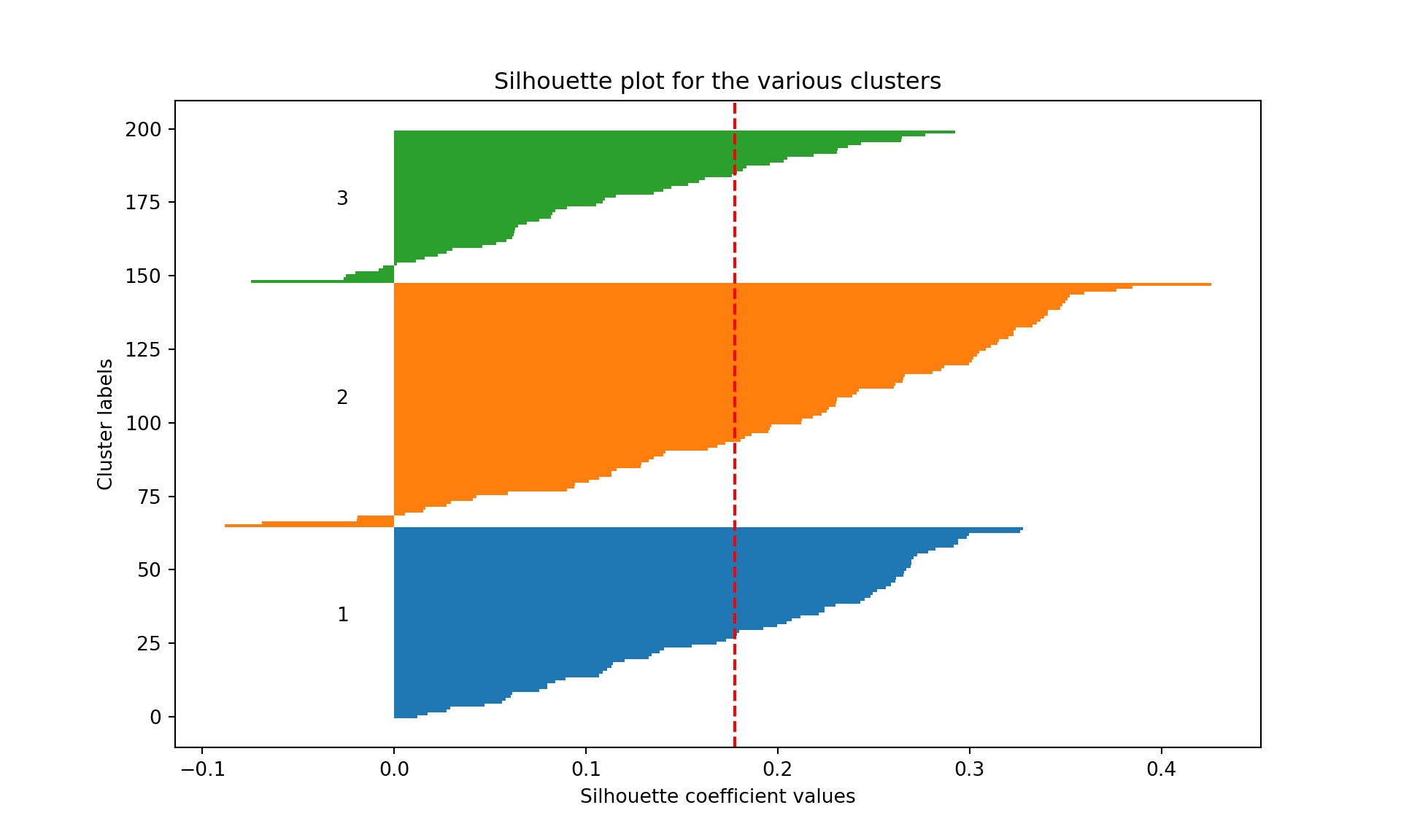
We see that the average silhouette considering the all three clusters is 0.12. Cluster 2 has some wines badly clustered (silhouette of 0.06, the lowest, and several wine with negative silhouettes). Cluster 3 is the most homogeneous cluster and the best separated from the other two.
Your turn
Repeat the clustering analysis on one of the datasets seen in the course (like the real_estate_data or nursing_home). Evidently, this is not a supervised task, therefore, you may choose to leave the outcome variable out of your analysis.